Wednesday, July 5, 2023

Column-MainAxisAlignment

 MainAxis VS CrossAxis


MainAxisAlignment Properties

  1. MainAxisAlignment.start: All widgets start from the top 
  1. MainAxisAlignment.end: All widgets start from the end
  1. MainAxisAlignment. centre:All widgets start from the centre
  1. MainAxisAlignment.spaceBetween: First & Last widget no space & space between inner widget
  1. MainAxisAlignment.spaceAround: first and last widget with half of the space of inner widgets
  1. MainAxisAlignment.spaceEvenly: All widgets wrapped with equal space

Coding Example

import 'package:flutter/material.dart';

void main(List<String> args) {
  runApp(MaterialApp(
    home: Scaffold(
      body: Center(
        child: Column(
          mainAxisAlignment: MainAxisAlignment.start,
          children: [
            Container(
              color: Colors.red,
              width: 100,
              height: 100,
              child: const Center(child: Text("First Child")),
            ),
            Container(
              color: Colors.green,
              width: 100,
              height: 100,
              child: const Center(child: Text("Second Child")),
            ),
            Container(
              color: Colors.blue,
              width: 100,
              height: 100,
              child: const Center(child: Text("Third Child")),
            ),
          ],
        ),
      ),
    ),
  ));
}


Tuesday, July 4, 2023

Row & Column Widget

 Row Widget

The row is a multi-child widget which arranges its children horizontally.


Coding Example


import 'package:flutter/material.dart';

void main(List<String> args) {
  runApp(MaterialApp(
    debugShowCheckedModeBanner: false,
    home: Scaffold(
      body: Center(
        child: Row(
          mainAxisAlignment: MainAxisAlignment.spaceAround,
          children: [
            Container(
              color: const Color.fromARGB(255, 142, 109, 8),
              height: 100,
              width: 100,
              child: const Center(
                  child: Text(
                "first child",
                style: TextStyle(
                    fontSize: 10,
                    fontWeight: FontWeight.bold,
                    color: Colors.white),
              )),
            ),
            Container(
              color: const Color.fromARGB(255, 11, 21, 168),
              height: 100,
              width: 100,
              child: const Center(
                  child: Text(
                "Second child",
                style: TextStyle(
                    fontSize: 10,
                    fontWeight: FontWeight.bold,
                    color: Colors.white),
              )),
            ),
            Container(
              color: const Color.fromARGB(255, 164, 15, 62),
              height: 100,
              width: 100,
              child: const Center(
                  child: Text(
                "Third child",
                style: TextStyle(
                    fontSize: 10,
                    fontWeight: FontWeight.bold,
                    color: Colors.white),
              )),
            ),
          ],
        ),
      ),
    ),
  ));
}


Column Widget

Column widget is a multi-child widget which arranges its children vertically.

Coding Example


import 'package:flutter/material.dart';

void main(List<String> args) {
  runApp(MaterialApp(
    debugShowCheckedModeBanner: false,
    home: Scaffold(
      body: Center(
        child: Column(
          mainAxisAlignment: MainAxisAlignment.spaceAround,
          children: [
            Container(
              color: const Color.fromARGB(255, 142, 109, 8),
              height: 100,
              width: 100,
              child: const Center(
                  child: Text(
                "first child",
                style: TextStyle(
                    fontSize: 10,
                    fontWeight: FontWeight.bold,
                    color: Colors.white),
              )),
            ),
            Container(
              color: const Color.fromARGB(255, 11, 21, 168),
              height: 100,
              width: 100,
              child: const Center(
                  child: Text(
                "Second child",
                style: TextStyle(
                    fontSize: 10,
                    fontWeight: FontWeight.bold,
                    color: Colors.white),
              )),
            ),
            Container(
              color: const Color.fromARGB(255, 164, 15, 62),
              height: 100,
              width: 100,
              child: const Center(
                  child: Text(
                "Third child",
                style: TextStyle(
                    fontSize: 10,
                    fontWeight: FontWeight.bold,
                    color: Colors.white),
              )),
            ),
          ],
        ),
      ),
    ),
  ));
}


Sunday, July 2, 2023

Container-Decoration

 Decoration Property is used to set Container.

  1. Border
  2. Border Radius
  3. Border Shadow


Example

import 'package:flutter/material.dart';

void main(List<String> args) {
  runApp(MaterialApp(
    debugShowCheckedModeBanner: false,
    home: Scaffold(
      // backgroundColor: Colors.amber,
      appBar: AppBar(
        backgroundColor: Colors.black,
        title: const Text("Container"),
        centerTitle: true,
      ),
      body: Center(
        child: Container(
          // margin: EdgeInsets.all(20),
          // padding: EdgeInsets.all(30),
          // color: Colors.red,
          height: 200,
          width: 250,
          decoration: BoxDecoration(
              color: Colors.amber,
              border: Border.all(
                  color: const Color.fromARGB(255, 212, 6, 6),
                  width: 5,
                  style: BorderStyle.solid),
              borderRadius: const BorderRadius.only(
                  topLeft: Radius.circular(40),
                  bottomRight: Radius.circular(40)),
              boxShadow: const [
                BoxShadow(color: Colors.black, offset: Offset(6, 6))
              ]),

          child: const Center(
            child: Text(
              "welcome",
              style: TextStyle(fontSize: 20, fontWeight: FontWeight.bold),
            ),
          ),
        ),
      ),
    ),
  ));
}

Monday, June 26, 2023

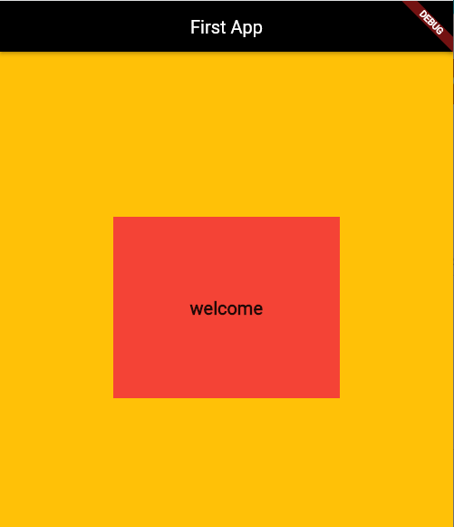
Container Widget

 The container is a rectangular box with only a single child.


Properties

  • width
  • height 
  • color 
  • padding 
  •  margin  
  • alignment
  • child
  •  decoration

Example (code + Output)


import 'package:flutter/material.dart';

void main(List<String> args) {
  runApp(MaterialApp(
    home: Scaffold(
      backgroundColor: Colors.amber,
      appBar: AppBar(
        backgroundColor: Colors.black,
        title: const Text("First App"),
        centerTitle: true,
      ),
      body: Center(
        child: Container(
          // margin: EdgeInsets.all(20),
          // padding: EdgeInsets.all(30),
          color: Colors.red,
          height: 200,
          width: 250,
          child: const Center(
            child: Text(
              "welcome",
              style: TextStyle(fontSize: 20, fontWeight: FontWeight.bold),
            ),
          ),
        ),
      ),
    ),
  ));
}

Text Widget

Text Widget

Text is the basic widget in Flutter used to display string.


Text Properties

  • fontSize
  • color 
  • fontWeight
  •  fontStyle 
  • fontfamily
  •  letterSpacing 
  •  wordSpacing 
  • backgroundColor

Example
import 'package:flutter/material.dart';

void main(List<String> args) {
  runApp(MaterialApp(
    home: Scaffold(
      backgroundColor: Colors.green,
      appBar: AppBar(
        backgroundColor: Colors.black,
        title: const Text("Weather App"),
        centerTitle: true,
      ),
      body: const Center(
          child: Text(
        "Welcome to Flutter",
        style: TextStyle(
          fontSize: 40,
          fontWeight: FontWeight.bold,
          color: Color.fromARGB(255, 59, 8, 4),
          backgroundColor: Colors.amber,
          fontStyle: FontStyle.italic,
          decoration: TextDecoration.underline,
          // letterSpacing: 15,
          wordSpacing: 15,
        ),
      )),
    ),
  ));
}

Wednesday, June 21, 2023

Scaffold Widget

 Scaffold Widget


  1. The Scaffold widget occupies the whole screen of the device 

  1. Provides the visual structure for the UI of the Flutter app

Properties

  • appBar
  •  body
  •  floatingActionButton
  • drawer
  • backgroundColor
  • bottomNavigationBar

Example (VS code)

import 'package:flutter/material.dart';

void main(List<String> args) {
  runApp(MaterialApp(
      home: Scaffold(
          backgroundColor: Colors.amber,
          appBar: AppBar(
            backgroundColor: Colors.red,
            centerTitle: true,
            title: Text("Profile App"),
          ),
          body: Center(
            child: Text(
              "Welcome to Flutter",
              style: TextStyle(fontSize: 30),
            ),
          ))));
}


Tuesday, June 20, 2023

App bar

 import 'package:flutter/material.dart'; //dart language


void main(List<String> args) {
  runApp(MaterialApp(
    home: Scaffold(
      appBar: AppBar(
        title: Text("First App"),
        backgroundColor: Color.fromARGB(255, 31, 3, 82),
        centerTitle: true,
      ),
    ),
  ));
}

Linked List Implementation using C++ Structure

3 Nodes Linked List Implementaion Single Linked list #include<iostream> using namespace std;   struct Node{ int data; Node* next; Node...